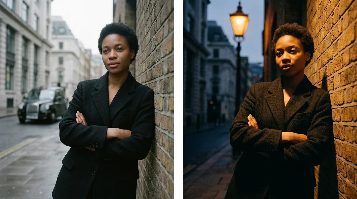
Lighting makes the difference between an AI-generated garment illustration and an AI-generated fashion photograph. The same dress, same silhouette, same fabric looks completely different under soft diffused light versus a single dramatic spot. One reads as commercial catalog. The other reads as editorial. Both work depending on what you need.
Most AI fashion prompts ignore lighting entirely. You get whatever the model defaults to: flat, even, generic illumination that looks like it was shot in an office. Two or three lighting terms in your prompt change the entire character of the output.
This guide covers the lighting setups that produce the best results in AI fashion image generation and how to describe them so the AI interprets them correctly.
Studio lighting: the foundation
Studio lighting means controlled, indoor illumination with identifiable light sources. You see it in lookbooks, e-commerce photography, and most commercial fashion imagery. The AI handles studio setups well because they dominate fashion photography datasets.
Soft diffused light is the most versatile option. Think of a large softbox or a window with a sheer curtain. The light wraps around the subject, fills shadows gently, and renders fabric texture without harsh contrast. It produces reliably good AI results.
Prompt: "soft diffused studio lighting" or "large softbox lighting, even illumination"
Single key light with fill adds more dimension. One dominant light source (usually from upper left or upper right) defines the shape, while a weaker fill on the opposite side keeps shadows from going black. Standard editorial setup. More dramatic than diffused, still controlled.
Prompt: "single key light from upper left, subtle fill light from right, studio background"
Butterfly lighting places the light directly above and in front of the subject, casting a small shadow under the nose and chin. Named for the butterfly-shaped shadow. A classic beauty and fashion setup that flatters faces and renders fabric evenly across the front of the garment.
Prompt: "butterfly lighting from directly above, even illumination on face and garment"
Rim lighting places the light behind or to the side of the subject, throwing a bright edge around the silhouette. Dramatic, and good for showing garment shape and silhouette. The garment's outline glows against a darker background.
Prompt: "rim lighting from behind, silhouette edge glow, dark studio background"
Natural lighting
Natural light prompts produce different results from studio prompts. The AI associates "natural light" with specific contexts: outdoor settings, window-lit interiors, golden hour warmth. Those associations carry entire environmental packages, not just the light itself.
Window light is the natural-light equivalent of soft diffused studio light. Indirect sunlight through a large window produces directional light that wraps around the subject. Specify whether it comes from the left, right, or front. Direction matters for how the AI renders fabric texture and shadow.
Prompt: "soft natural window light from the left, indoor setting" or "large window with sheer curtain, diffused daylight"
Golden hour gives you warm, low-angled light with long shadows. The AI renders it with amber tones and a romantic quality. It works well for flowing garments in silk or chiffon because warm light catches fabric movement.
Prompt: "golden hour natural light, warm amber tones, low sun angle"
Overcast daylight is flat, even, and cool-toned. No directional shadows, no warmth. Actually useful for fashion because it renders fabric color most accurately, with no warm or cool bias from the light source.
Prompt: "overcast natural daylight, even illumination, neutral color temperature"
Harsh noon sun creates hard shadows and high contrast. Most fashion photographers avoid it. But for certain looks (sharp geometric shadows across a white garment, strong contrast on street style) it can work. The AI produces it reliably because the pattern (bright highlights, hard shadow edges) is unambiguous.
Prompt: "harsh midday sun, strong directional shadows, high contrast"
Editorial and dramatic lighting
Here lighting becomes a creative tool instead of a technical one. Editorial lighting breaks commercial photography rules to build mood.
Low key lighting keeps most of the image dark with the subject emerging from shadow. Only parts of the garment are lit. The effect is moody and tense, and pairs well with velvet and dark fabrics where light catches edges and textures selectively.
Prompt: "low key dramatic lighting, subject emerging from darkness, selective illumination"
High key lighting floods the scene with light. Everything bright, shadows minimal, background pure white. Classic fashion advertising: clean and product-focused. The AI handles it well because high-key fashion photography fills its training data.
Prompt: "high key lighting, bright even illumination, white background, minimal shadows"
Color gel lighting introduces colored light sources. Blue, red, magenta, amber. All produce a stylized editorial look. Be specific about which colors go where. "Purple gel light from the left, warm amber from the right" gives you a split-tone editorial image.
Prompt: "blue gel light from left, warm amber gel from right, fashion editorial studio"
How lighting interacts with fabric
Different fabrics respond to light differently, and the AI knows it. The right pairing of light and fabric produces sharper, more convincing results.
Shiny fabrics (silk charmeuse, satin) look best under soft, directional light that gives you visible but gentle highlights. Hard light on satin blows out to hot spots. Diffused light with a clear key direction shows the sheen without overexposing it.
Matte fabrics (crepe, linen, wool) need stronger, more directional light to reveal their texture through shadow. Flat diffused light makes matte fabrics look dead. A key light with moderate shadow depth brings out the surface character.
Sheer fabrics (chiffon, organza) look best backlit. Light passing through sheer fabric produces a luminous quality that real fashion photographers chase constantly. Prompt for rim light or backlight when working with sheers.
Textured fabrics (tweed, bouclé, velvet) need directional light to show their surface. Side lighting at about 45 degrees puts shadows within the texture that make it readable. Flat light kills texture.
Common lighting mistakes
No lighting direction at all. "Good lighting" tells the AI nothing. Specify direction (left, right, above, behind), quality (soft, hard, diffused), and mood (commercial, editorial, dramatic).
Contradictory descriptions. "Soft diffused dramatic spot lighting" is a contradiction. Diffused light and spot light are opposites. Pick one character for the light and commit.
Forgetting the background. Lighting hits the background too. "White studio background" and "dark moody lighting" fight each other. Dark mood needs a dark background. White background needs bright, even lighting.
Over-specifying. "Three-point lighting with key light at 45 degrees from upper left at 5600K, fill light at half power from lower right, and rim light from directly behind at 3200K" is technically precise, but the AI won't parse all of it. Stick to two or three lighting terms. "Single key light from left, warm rim light from behind" outperforms a full lighting diagram every time.
FAQ
What lighting produces the most realistic AI fashion images?
Soft diffused studio light with a single key direction. Real fashion photography uses this setup more than any other, so the AI has the deepest reference pool for it. Add a fill light from the opposite side for dimension.
How do I make AI-generated fabric look better with lighting?
Match the light to the fabric. Soft diffused light for shiny fabrics like silk charmeuse. Directional side lighting for textured fabrics like tweed or velvet. Backlight for sheer fabrics like chiffon and organza.
Should I specify color temperature in AI prompts?
Not with numbers. Terms like "5600K" or "3200K" don't translate well. Use descriptive language instead: "warm golden light" or "cool daylight" or "neutral studio light." The AI maps these to the right visual output.
How many lighting terms should I include in a prompt?
Two to three. Light source direction, light quality (soft/hard/diffused), and background. Beyond that the AI starts ignoring or conflicting terms. "Single key light from upper left, soft diffused, dark background" covers it.