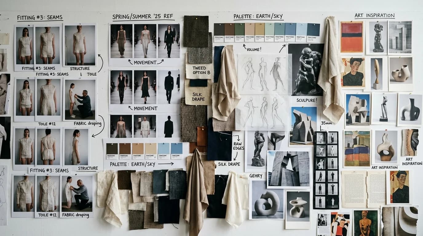
Traditional mood boards are cut-and-paste collages. Magazine tears, fabric swatches, color chips, screenshots from films. They communicate a feeling, an atmosphere, a direction. But they lack precision. The gap between a mood board and the actual collection gets filled by the designer's interpretation. That's what makes them useful, and what makes them fail when someone else needs to understand what you mean.
AI mood boards work differently. Instead of collecting existing images that approximate your idea, you generate images that show it directly. Want to see what a cocoon coat in burgundy wool looks like under overcast light? Generate it. Want to compare that same coat in three different fabrics? Generate all three. The mood board becomes a preview of the collection, not a gesture toward it.
Here's how to use AI fashion image generation as a mood board tool, from initial exploration through to a board with clear design direction.
The problem with traditional mood boards
A mood board with a photo of a 1970s California sunset, a swatch of camel cashmere, and a frame from a Terrence Malick film tells you: warm tones, natural textures, golden light, romantic ease. Good. Now design the collection.
The trouble starts when you hand that mood board to a patternmaker, a fabric sourcer, or a production partner. "Romantic ease" means different things to different people. The sunset could inspire a color palette, a photography direction, an emotional tone, or all three. The cashmere swatch is the only concrete garment reference on the entire board. And it's a fabric, not a design.
AI mood boards cut through that ambiguity. Instead of an image that evokes the idea, you show an image of the idea itself. A generated image of a bias-cut midi dress in camel cashmere, photographed in golden hour light. Now everyone looking at the board sees the same garment.
Mood board layers: from abstract to concrete
Build your AI mood board in layers. Start broad, get specific.
Layer 1: Atmosphere. Generate 3-4 images that set the mood without specifying garments. "Soft golden hour light on natural linen textures, muted earth tones, quiet minimalism." These are your emotional foundation. Use text-to-image with intentionally loose prompts.
Layer 2: Color and material. Generate fabric swatches and color combinations. "Close-up of camel cashmere fabric, soft texture, warm matte surface." "Swatch of ivory linen with natural wrinkle, photographed in daylight." These lock down the material palette.
Layer 3: Silhouettes. Generate garment shapes without full detail. Use the silhouette vocabulary loosely. "Cocoon coat shape in neutral tones, minimal background." "Column dress shape, relaxed fit, mid-calf length." You're testing proportions here, not finalizing designs.
Layer 4: Specific garments. Generate the pieces themselves. Full fashion vocabulary prompts: silhouette, fabric, construction, neckline, color. "A-line midi skirt in camel cashmere with knife pleats, photographed in soft window light." These are the closest you'll get to a collection preview before sampling.
Layer 5: Styling and context. Generate looks in context. How do the pieces layer? What shoes, what setting? "Model wearing cocoon coat over column dress, both in camel tones, walking on a quiet street in soft afternoon light."
Each layer builds on the one before it. By layer 5, you have images that look like photographs of garments that don't exist yet.
Practical workflow
Step 1: write your design brief
Before you generate anything, write a one-paragraph design brief. Who is this collection for? What's the season? The emotional tone? The material constraints?
Example: "Fall/Winter capsule collection. 8 pieces. Target: women 28-45 who want elegant, unfussy clothes for work and weekend. Material palette: cashmere, wool, linen. Color palette: camel, ivory, charcoal. Mood: quiet, warm, precise."
Step 2: generate atmosphere images (15 minutes)
Use loose prompts to set the visual world. Generate 8-10 images, keep 3-4. These don't need to show garments. They set the tone.
Step 3: generate material explorations (20 minutes)
Close-up fabric prompts. Generate swatches of each material in your palette. Compare textures side by side. Add behavior keywords: "soft matte surface" for cashmere, "natural wrinkle texture" for linen.
Step 4: generate silhouette explorations (30 minutes)
This is where you spend the most time. Try different shapes in your material palette. A trapeze coat versus a cocoon versus a column. The same fabric in three silhouettes looks different every time. Generate 5-8 options per silhouette, keep 2-3.
Step 5: refine specific pieces (30 minutes)
Take the silhouettes you liked and add detail. Necklines, sleeve types, construction details. Precise fashion vocabulary matters here more than anywhere else. Full prompts with all seven layers from the description framework.
Step 6: assemble the board
Arrange your selected images in a grid. Group by layer: atmosphere across the top, materials on one side, silhouettes in the center, refined pieces at the bottom. Add text annotations: fabric names, color hex codes, silhouette names, construction notes.
Someone should be able to read the board and understand the collection without you in the room.
What AI mood boards won't do
Show you how fabric feels. A generated image of silk charmeuse shows drape and sheen, not hand. If you haven't worked with a fabric before, you still need the real swatch.
Nail color accuracy. AI color is approximate. "Champagne" in a generated image might land somewhere different from "champagne" in your fabric book. Use generated images for directional color work, then confirm finals against physical references.
Replace drape on a real body. How a bias-cut skirt falls on a dress form versus a person with actual proportions is something AI gets close to but doesn't get right. The mood board shows intent. The muslin shows reality.
FAQ
Can AI mood boards replace traditional mood boards?
For garment exploration and visual direction, they're better. For abstract feeling and physical materials (real swatches, real paper), traditional boards still win. Most designers will use both. AI for garments, traditional for the tactile stuff.
How long does it take to build an AI fashion mood board?
About two hours for a focused session. 15 minutes for atmosphere, 20 for materials, 30 for silhouettes, 30 for refined pieces, 15 for assembly and editing. Faster than sourcing a traditional board, and the results sit closer to your actual design intent.
What's the most important layer of an AI mood board?
Layer 4, the specific garment generations. Anyone can gather atmosphere images from Pinterest. What you can't do with a traditional board is show accurate previews of garments that don't exist yet. That's where AI earns the extra effort.
Should I use text-to-image or image-to-image for mood boards?
Text-to-image for layers 1-3 (atmosphere, materials, silhouettes) because you want range. Image-to-image for layers 4-5 (specific garments, styling) because you want to lock proportions and refine details. Same logic as our text-to-image vs image-to-image guide.